Weekly Challenge 53 ~ Critic Me!

Collapse
This topic is closed.
X
X
 
  • Filter
  • Time
  • Show
Clear All
new posts
  • sacannon
    MAX! Mastermind
    • Aug 2006
    • 6556

    #16
    Originally posted by ValerieElaine View Post
    This is the 2nd one . I think it s the colours but I give up


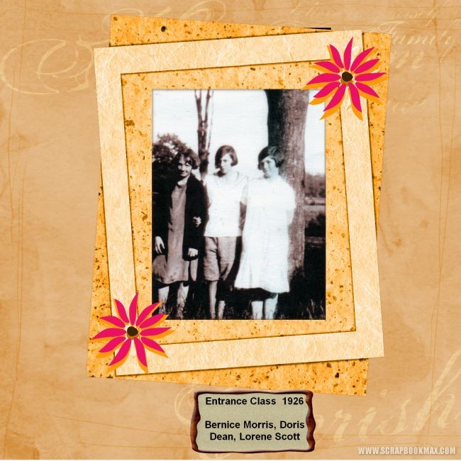
    I think the bottom frame should be a little darker to add a little contrast, Maybe leave the "Entrance Class 1926 in the frame, but move it, and use the rest as journaling across the bottom of the page.
    [SIGPIC][SIGPIC][IMG]

    Comment

    • sacannon
      MAX! Mastermind
      • Aug 2006
      • 6556

      #17
      Originally posted by pickngrin View Post
      OK here is mine, it is probably the least favorite of mine. I think it is probably because I am not the frilly type and it is a little more plain than what I usually do (I knew I would end up critiquing myself) . Not sure though, help....

      hmmm, not sure....maybe fade the flowers a bit to the background???
      [SIGPIC][SIGPIC][IMG]

      Comment

      • O2BNGdHope
        Digi Sage
        • Nov 2007
        • 2399

        #18
        I love this kind of thing. I wish SBM had a section just for everyone to add their opinions on how to improve a layout. That way, only the people wanting true criticism could get help with a layout! Great idea, Fiona!
        Melanie


        In case I go missing call Moonlightpearl, Granny, twpclerk or Smile! Then have them call Crops because we're probably together at the Yoville Races!

        Comment

        • nanwu
          Digi Sage
          • Apr 2007
          • 2127

          #19
          Thanks for the advice....I have taken it all on board and this is the new page.....I think it rocks...(have to add the photo later as it is on my heritage hard drive and my daughter is loaning it at the moment)
          Kit used is Chiffon Rose by Deanne Gow_Smith (aka moonbeam) and I do believe that the word art on the background was from kbdesigns and created by our very own Jazz (if this isn't correct please advise)
          Attached Files


          My buddies are Angelwithin, omajo, babylicious36, all my memories. and Angle

          Comment

          • sacannon
            MAX! Mastermind
            • Aug 2006
            • 6556

            #20
            Looks great nanwu! Here is mine to be roasted! LOL... I did this one 2 years ago. Wow, time flies!

            [SIGPIC][SIGPIC][IMG]

            Comment

            • pickngrin
              Layout Whiz
              • Jul 2008
              • 923

              #21
              Originally posted by sacannon View Post
              Looks great nanwu! Here is mine to be roasted! LOL... I did this one 2 years ago. Wow, time flies!

              I think this one is calling for some ribbons somewhere, that is about it though, too much on this one would take away from the pictures. I like it as it is.


              My buddies are Crops2Dawn and AutisticWonder

              Comment

              • grannywin
                Layout Whiz
                • Sep 2006
                • 946

                #22
                All of these layouts are so nice, it is hard to criticise, but I know we are our own worst critic!

                Thanks for the comments on my layout so far. Don't know if I will get it reworked by the deadline, but I definitely want to try all the suggestions.

                Nanwu, I love the redesign you uploaded. You received good advice, but I still would like to see more of your father. Allow more empty space around his head inside the frame.

                ValerieElaine, that area in the top left would be perfect for a journal, a second photo, or an embellishment. For your second layout, I agree that you might want to change the color of the inner frame. Could you coordinate with the flower colors? If you find a "metal tag", you could add the text to the outer frame. I love the background and the photo. A ribbon and bow that wrap the photo might also look nice.

                Pickngrin, this is so lovely, don't know what to change. Maybe focus on only one picture in the lower right.

                Sacannon, I love the snowflakes theme. The only change I would suggest is to remove the frames and use a blending circle shape for each photo.

                Comment

                • LindaPete
                  Mad Scrapper
                  • Mar 2008
                  • 347

                  #23
                  This is a fabulous challenge idea Fiona!

                  Visit my blog at www.mrsjaybob.com

                  Comment

                  • Marion
                    MAX! Mastermind
                    • Feb 2006
                    • 6460

                    #24
                    I need a makeover, what do you think I could do with this one?

                    Comment

                    • Marion
                      MAX! Mastermind
                      • Feb 2006
                      • 6460

                      #25
                      Originally posted by grannywin View Post
                      Here is my entry to be critiqued. Deanne made a beautiful set of embies to work with that week, but I think I ruined it with the green paper. I have this layout on my wall and hate it every time I see it. Critic away!

                      http://www.scrapbookmax.com/gallery/...25108&cat=2431
                      I agree with everyone else on this one, the green is to green, it should be more subdued. Other then that, it looks great.

                      Comment

                      • Marion
                        MAX! Mastermind
                        • Feb 2006
                        • 6460

                        #26
                        Originally posted by ValerieElaine View Post
                        I have 2 pages .This one I like but there is something missing

                        I would enlarge the picture and make it more of a focus and then I would add some journaling in the extra space.

                        Comment

                        • Marion
                          MAX! Mastermind
                          • Feb 2006
                          • 6460

                          #27
                          Originally posted by ValerieElaine View Post
                          This is the 2nd one . I think it s the colours but I give up

                          Too much yellow. Maybe change the background color??

                          Comment

                          • Marion
                            MAX! Mastermind
                            • Feb 2006
                            • 6460

                            #28
                            Originally posted by pickngrin View Post
                            OK here is mine, it is probably the least favorite of mine. I think it is probably because I am not the frilly type and it is a little more plain than what I usually do (I knew I would end up critiquing myself) . Not sure though, help....
                            The layout is lovely, but as you probably notice, I love big pictures on my layouts I like the focus on my pictures. first I would enlarge the first picture and make it the focus picture and then maybe overlap the second one a bit smaller. Soften the background slightly and also change the opacity on the other roses.

                            Comment

                            • Marion
                              MAX! Mastermind
                              • Feb 2006
                              • 6460

                              #29
                              Originally posted by sacannon View Post
                              Looks great nanwu! Here is mine to be roasted! LOL... I did this one 2 years ago. Wow, time flies!

                              I would remove the frames, enlarge the fotoos and use a blur shape for the photoos to soften the edges and I would make the skates bigger too, so they tell the story better.

                              Comment

                              • Marion
                                MAX! Mastermind
                                • Feb 2006
                                • 6460

                                #30
                                and tomorrow I won't have any friends left on SBM

                                Comment

                                Working...
                                X