It's an interesting color scheme. The opposite of blue is orange, and dark orange is brown so you basically have the strong relationship between blue and brown as a basis. The addition of green creates tension because the opposite of turquoise/seafoam is basically a very red orange. The tension creates interest. Also the high contrast here enhances that effect, so when you look at it you see only 2 colors even though there are 4-5 colors on the page, i.e. shadows, alternating lines in the blue texture, etc.
Anyhow it's definitely a strong statement which displays creative freedom. I like that. Too often aggressive color schemes get overlooked, which is a real shame IMO. Nature uses every color in every combination, so art should also. Fear no color!
Scrapbook MAX! is the fun and easy digital scrapbooking software for Windows. Download a free trial version at .
Thanks, Corey! When I made the page, I of course wasn't considering all the things you explained, but it's really cool to learn why something "works" from a "technical" perspective.
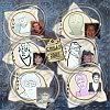
What you said about the green was particularly interesting (the olive background) - I was originally trying to match the background exactly to the brown paper scrap so that I would only have two colours in my LO, but I liked how the green worked with the other colours, and how it kind of "morphed" into brown when the other paper scraps were placed on top of it.
I will definitely not fear colour as I scrap; every scrapper should boldly scrap where no scrapper has scrapped before!
Comment